
The Art and Science of Nursery Colors: Creating Stimulating Yet Soothing Environments for Infants


The question most parents type into a search bar at 11pm, with a baby asleep on one shoulder, is some version of this: which nursery wall colour will help my child sleep. The honest answer is that the developmental research has more to say about how an infant's visual system matures than about which specific pale blue will buy you an extra forty minutes of unbroken sleep — but it has more to say than the paint-brand editorial pages let on, and most of what it says is worth knowing before you commit to a wall.
Calming nursery colors, taken as a category, are doing more work in 2026 than they were two years ago. Search demand for the phrase has roughly doubled since spring 2025 — driven, as far as one can tell, by the same broader parental interest in sleep science and nervous-system regulation that has reshaped a lot of infant-care discourse over the same period. This piece is a calm walk through what the research actually demonstrates, which named hues match it, and which mistakes are worth avoiding.
What "Calming" Actually Means
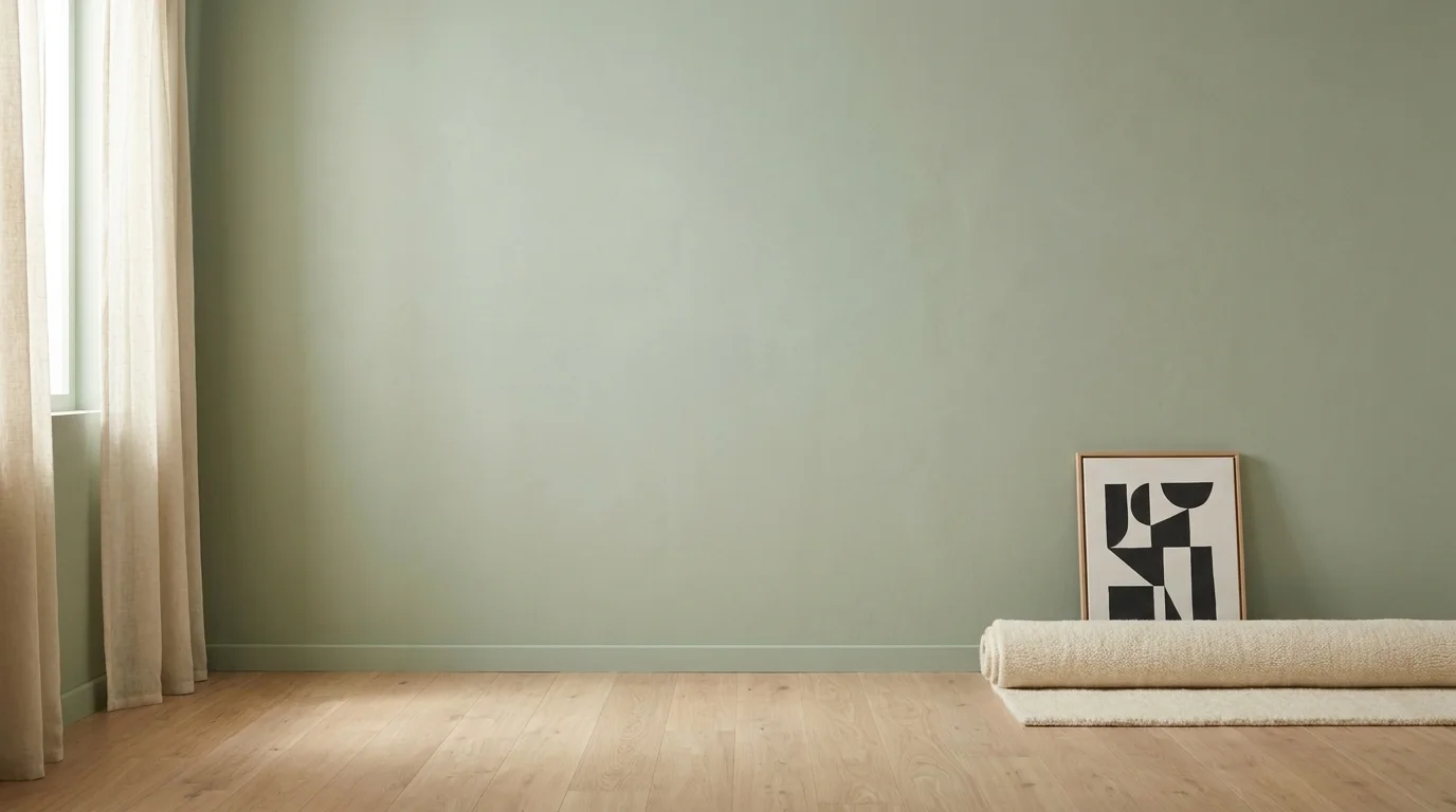
Most pages on calming nursery colors assert that blue or green calms infants, without explaining the mechanism. The honest version is this: low-saturation cool tones present the visual cortex with less arousing input than high-saturation warm tones do, and the literature on infant sleep regulation generally treats the bedroom's visual environment as one of several inputs to the wind-down process — sound, light intensity, temperature, predictability of routine being the others. None of those inputs is more important than the others on its own (How Nurture Matters: Designing the Nursery — developmental science chapter).
This matters because the popular discourse routinely overstates the wall colour's contribution. A wall painted in a thoughtful low-arousal tone will not, on its own, change an infant's sleep architecture; what it can do is reduce one source of evening visual stimulation that would otherwise make the wind-down harder. That is a real, if modest, effect. It is also the level at which a parent should plan around it.
Two pieces of vocabulary worth introducing here, because the rest of the piece uses them. Saturation is how vivid a colour is — neon yellow is high-saturation; oat is low-saturation. Arousal is the nervous-system term for how much activation a stimulus produces — high-arousal stimuli increase heart rate and alertness, low-arousal stimuli reduce them. The rule of thumb that runs through the calming-colour literature is: lower the saturation, lower the arousal, especially in the sleep zone. It is not a complete rule, but it is a useful one.
A Stage-Aware Color Framework
The single biggest gap in most nursery-color editorial is that it treats a two-week-old and a fourteen-month-old as if they were the same audience. They are not. An infant's visual system matures across the first year on a fairly well-characterised timeline, and colour choices land differently at each stage.
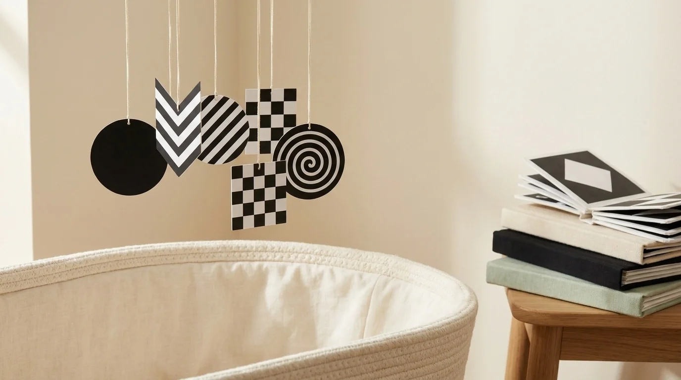
0-3 months. Newborns are functionally close to legally blind. They can resolve only high-contrast shapes at close distance; full colour vision develops gradually from roughly four months (HALO — High Contrast, Big Impact). The wall colour in this window matters less to the infant than to the parent; what matters to the infant is the contrast environment immediately around the cot and the changing area. This is the developmental case for a small black-and-white visual zone (a mobile, a small canvas of geometric shapes, a board book) — not the entire room.
3-6 months. Red discrimination emerges around two to four months, and brighter primary colours start to become developmentally meaningful after about three (All About Vision — Nursery Colors and Baby Vision). The synapse-formation surge in the visual cortex accelerates over this same window. By one estimate, an infant's visual cortex holds roughly fifty percent more synapses than an adult's between four and twelve months — the peak window of visual-environment sensitivity in early development (Abiie — Colors and Brain Development). This is the right time to introduce additional colour in books, toys, and one accent area, while keeping the sleep zone visually quiet.
6-12 months. The full palette becomes legible to the infant. Calming low-saturation tones on the sleep wall remain appropriate; the rest of the room can hold more colour without overstimulation, as long as the sleep zone stays restrained.
12+ months. Colour preference begins to form. From around this age the toddler will, often quite firmly, have opinions about which colour belongs where, and the parent's job shifts toward co-design within sensible constraints (sleep zone restrained, accent zone permitted).
This frame tells us where to spend visual budget. It does not tell us that any one named colour is "scientifically the best" — that claim is, broadly, not what the literature says.
Calming Palettes with Names
Within the low-arousal frame above, the named hues most commonly recommended across both paint-brand editorial and developmental sources fall into three families. I list these as illustrative anchors, not as a paint listicle — the case for any one of them rests on the saturation/arousal logic above, not on the brand colour name itself.
In the soft blue family, Benjamin Moore Sweet Bluette 813 and Windswept OC-94 are the most-cited examples for sleep-zone walls; they read as cool but not clinical, and they pair with most natural-fibre textiles (Benjamin Moore — Nursery Color Palettes). In the warm low-saturation neutral family, Mountain Peak White OC-121 and Constellation AF-540 read warmer than a clinical white and do not flatten the room at night. In the soft warm family, Hathaway Peach HC-53 and Weston Flax HC-5 sit at the low-arousal end of the peach-and-flax spectrum and read as gentle in low light. Sage greens — referenced across paint-brand editorial without a single dominant named SKU — sit in the same low-arousal band and pair with most accent palettes (Avery Row — Colour Psychology in the Nursery).
If you find the named-paint level of specificity overwhelming, the practical takeaway is simpler: pick the saturation level first, then pick a hue family the household lives well with. The saturation does the regulatory work. The hue does the aesthetic.
The 2026 Earthbound Neutrals (and the Gender-Neutral Nursery)
The dominant 2026 nursery design trend, named consistently across paint-brand editorial and parenting publications, is "Earthbound Neutrals": muted earth tones replacing the older pastel-pink and pastel-blue defaults (Americord — Nursery Trends for 2026; HALO — Color of the Year 2026). Pantone's 2026 Color of the Year is Cloud Dancer, a soft modern white. Benjamin Moore's is Silhouette, a rich modern neutral. Sherwin-Williams' is Universal Khaki, a warm beige with green undertones. Glidden's is Warm Mahogany. Valspar's is Warm Eucalyptus. Every major paint brand released a low-saturation, grounded, nature-leaning colour of the year — a coordinated shift that reframes the gender-neutral conversation away from pastels and toward genuine earth tones.
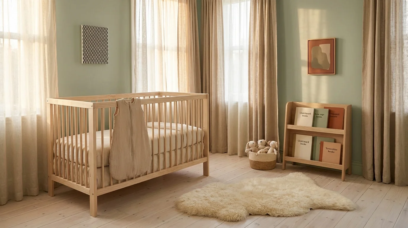
The palette family worth knowing — sage green, terracotta, hazelnut, cocoa, oat, mushroom, and creamy alabaster — works as a 2026 default for gender-neutral nursery colors for two reasons that are worth separating. Aesthetically, the family is biophilic: it borrows from natural settings (forest, soil, stone, cream-coloured plaster) and reads as quiet and warm without leaning on cultural pink/blue defaults. Developmentally, the family is low-saturation, which means it sits comfortably inside the calming-colour logic above; the room reads as restful for an infant and unprovocative for an adult.
A note on what this is and is not. The shift away from pastel-pink and pastel-blue does not, in itself, deliver a developmental advantage to the infant. It does, on the parental side, decouple early-childhood design from a cultural gendering that many households would now prefer to opt out of. Those are different motivations, and they are both legitimate.
Nursery Colors to Avoid
Avoid neon yellow, bright red, and high-saturation orange as wall-to-wall nursery paint. These high-arousal colours can overstimulate infants and interfere with the wind-down environment, and the parenting and design press treat them consistently as colours to use as small accents at most (Omni Home Ideas — 5 Nursery Colors to Avoid; Buds and Bear — Why a Colourful Environment May Be Overstimulating Your Baby).
The fuller picture, for parents who want a working rule: any high-saturation primary colour painted wall-to-wall in the sleep zone is working against the wind-down environment. The same colour used as a small accent — a single canvas, a stripe in a play rug, the spine of a stack of books — is doing very different work. The mistake to avoid is volume; the same red that is overstimulating across four walls is delightful at twelve inches across.
A separate caution, because it comes up often: avoid pure clinical white as the sole wall colour. It is high in light reflectance, can read cold in evening light, and does not deliver the warmth-without-arousal effect that low-saturation warm neutrals (Mountain Peak White, Cloud Dancer, oat) provide. A "soft white" with a hint of warm undertone is almost always a better default than a pure cool white.
Color-Zoning by Function
The most practical decision a parent can make about nursery colour is not which palette to use but where to use it. Treat the nursery as a functionally zoned room.
The sleep zone — the wall the cot faces, and the corner the infant most often falls asleep looking at — wants the lowest-saturation tone in your palette. This is where the calming logic does the most work.
The change and play zone can be slightly more visually active without disrupting sleep. One accent — a saturated wall, a high-contrast graphic on a single canvas in the play corner, a more pattern-heavy rug — is the right level of stimulation for the visual-cortex window above.
The transition area (the door, the wall the parent stands at during a feed) is best kept neutral: it should not be a stimulus, because it is the zone you want the infant's attention to settle through.
This division is not in most paint-brand editorial because the paint brand does not segment a room. The reason to do it is that an infant's visual experience is not uniform across a small room — they spend disproportionate time looking at one wall, and that wall has a disproportionate influence on the wind-down.
What the Research Cannot Tell You
The research can tell us that infants do not see full colour until around four months, that high-contrast patterns are developmentally appropriate in the newborn window, that the visual cortex passes through a peak-synapse window between roughly four and twelve months, and that low-saturation tones present the nervous system with less arousing input than high-saturation tones do.
What the research cannot tell us — not yet, not in any individualised way — is whether a sage-green nursery wall will, for your particular baby, with their particular temperament and sleep architecture and household routine, deliver a meaningful sleep advantage over a pale-blue one. The variation between infants is too large and the effect size of wall colour alone, relative to everything else in the room, is too small for any honest answer at that level of granularity.
This tells us these things travel together; it does not tell us which lever, pulled in isolation, moves the needle. The honest version of the nursery-colour question is that the wall paint is one of several inputs to a calming environment, not the controlling input. Picking a low-saturation hue family the household lives well with, using stage-aware contrast in the early months, treating the sleep zone as quieter than the play zone, and avoiding high-arousal wall-to-wall saturation in the calming spaces — that is roughly what the evidence supports, and it is enough to act on.
The rest is taste, and taste is allowed.
Frequently Asked Questions
Low-saturation cool tones (soft blue, sage and muted greens, lavender) and low-saturation warm neutrals (oat, mushroom, alabaster) are the most calming choices for a nursery sleep zone. The mechanism is saturation, not hue — lower saturation presents the nervous system with less arousing visual input, which supports the wind-down environment.
Avoid neon yellow, bright red, and high-saturation orange as wall-to-wall nursery paint — these high-arousal colours can overstimulate infants and disrupt the wind-down. Pure clinical white is also worth avoiding as the sole wall colour; a warm-undertone white usually reads better at night. The same saturated colours work fine as small accents.
Yes, in the right dose. Newborns can only resolve high-contrast shapes for roughly the first four months — full colour vision develops gradually from around four months. A small high-contrast visual zone (a mobile, a canvas of geometric shapes, a board book) near the cot or changing area is developmentally appropriate for 0-3 months. The case for an entire black-and-white room is weaker.
The 2026 'Earthbound Neutrals' palette leads the gender-neutral category: sage green, terracotta, hazelnut, cocoa, oat, mushroom, and creamy alabaster. The major paint brands' 2026 colours of the year (Pantone Cloud Dancer, Benjamin Moore Silhouette, Sherwin-Williams Universal Khaki, Glidden Warm Mahogany, Valspar Warm Eucalyptus) all sit in this family.
Modestly. The visual environment is one of several inputs to an infant's wind-down — alongside sound, light intensity, temperature, and routine predictability. Low-saturation tones in the sleep zone reduce evening visual arousal, which can support the wind-down. The wall colour is not the controlling input, and any claim that a specific named hue will deliver a measurable sleep advantage on its own is overstated.
Stage-aware roughly maps onto four windows. 0-3 months: contrast matters more than colour; small black-and-white zone near the cot. 3-6 months: red discrimination emerges around 2-4 months and the visual-cortex synapse surge is underway; one accent area can hold more colour while the sleep zone stays restrained. 6-12 months: full palette becomes legible to the infant; calming sleep wall remains restrained. 12+ months: colour preference forms and the toddler can co-design within sensible constraints.
Check Out These Related Articles
Thriving Amidst Single Parenthood Challenges: Inspirational Stories of Strength and Resilience

Breaking Barriers: Empowering Single Dads to Thrive in Modern Parenthood

Navigating Parenthood Milestones: Expert Insights on Raising Children