Marketing Parenthood: The Strategic Use of Color in Family-Oriented Products and Branding

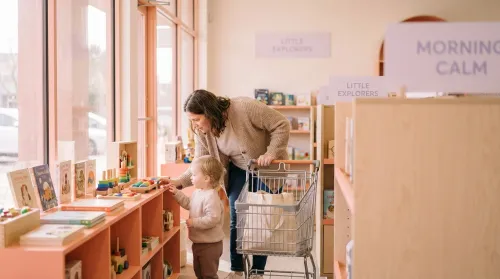
The honest version of the psychology of color in marketing and branding, in 2026, is that the topic has been written about so many times that the marginal abstract think-piece is worth essentially nothing. The competitive editorial position is concrete: name the brand, name the hex code, name the survey number, and name the cost of getting it wrong. That last one is the part most marketing posts skip, and it is the part this piece is going to spend the most time on, because if your business is selling diapers, formula, baby skincare, or a thirty-piece set of educational blocks to a sleep-deprived parent at 11pm, your color-equity is one of the most expensive intangible assets you own.
This is a working family-product playbook, with the sources on the table and the caveats spoken aloud.
The Stat Floor
The numbers that come up repeatedly across the most-cited color-psychology pieces are these. Color drives up to roughly 90% of an initial product impression, a figure traced to Singh's "Impact of Color on Marketing" research and cited by both USC's Applied Psychology blog and Help Scout's anchor piece on the topic (USC MAPP; Help Scout). 85% of consumers, in HubSpot's standing color summary, cite color as a primary purchase-decision factor; 93% of purchase decisions rely on visuals alone (HubSpot). Color increases brand recognition by up to 80%, per SevenKoncepts' 2026 round-up (SevenKoncepts). Brand consistency — of which color is the most-cited single component — adds up to 20% revenue growth in firms that maintain it, per Uncomn's 2026 trend report referencing the same survey set (Uncomn).
These are not subtle effect sizes. They are also not specific to family-product categories. The interesting question, for a brand operating in this space, is how those general patterns translate when the consumer is a parent making a considered, repeated, often emotionally loaded purchase on behalf of a small person.
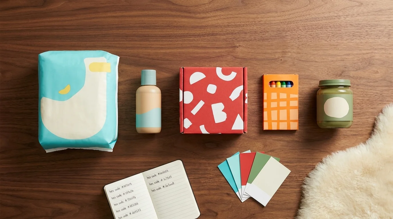
The Family-Product Color Cheat Sheet
Most marketing-color pieces ship a generic emotion table. This one is sized to a family-product context, with a named example brand and hex code where one is available. It is a working cheat sheet, not a universal claim — the next sections explain why the brands cluster where they do.
| Color family | Dominant association | Family-product use case | Example brand (hex) |
|---|---|---|---|
| Cyan / teal | Trust, calm, clinical reliability | Diapers, baby skincare, baby formula | Pampers Manganese Blue #00A9A4 |
| Deep blue | Authority, dependability, calm | Pediatric / clinical-adjacent goods | Gerber blue |
| Soft yellow | Cheerfulness, warmth, family-fun | Diapers (accent), early-toy packaging | Pampers Yellow Buttercup #F8B017 |
| Saturated red | Energy, play, attention | Toys, snack packaging, dollar-aisle | Fisher-Price Dragon Fire Red #EF4123 |
| Earthy green | Natural, organic, gentle | Organic baby food, eco baby skincare | Seventh Generation, Babyganics |
| Soft beige / cream | Comfort, premium, gentle | Premium baby skincare, organic feeding | Aveeno Baby |
| Black + white | High contrast, developmental | Newborn books, mobiles, early sensory | Wee Gallery, Indestructibles black-and-white series |
| Pink / pastel | Softness, traditional sentiment | Newborn apparel, gift packaging | Hanna Andersson newborn capsule |
| Bright orange | Optimism, value, accessible-price | Mid-market mass retail apparel | Crayola accent, Pampers American Orange #F5911B |
The table is a starting point. The next four sections are why the rows are not interchangeable.
The Trust Quadrant: Why Baby Brands Cluster in Cyan and Teal
If you walk a baby aisle in a US drugstore, or a baby-care aisle in a UK supermarket, the dominant wall-of-packaging color is somewhere between Pampers Manganese Blue and Aveeno's soft blue-green. This is not an accident, and it is not (mostly) a copying pattern. It is a coordinated answer to a structural buyer problem.
Blue is the single most-preferred color across genders — 57% of men and 35% of women name it as their top color, and roughly 33% of top global brands feature blue in their logos (HubSpot). For a category where the buyer is making a considered, trust-sensitive purchase on behalf of someone who cannot verify the choice (the baby), the cool-trust quadrant — cyan, teal, deep blue — is the lowest-risk dominant hue. It maps to the same associations that have made financial services, healthcare, and IT default blue.
Pampers' palette is the clearest worked example. The brand-color references are Manganese Blue #00A9A4 (the trust core), Yellow Buttercup #F8B017 (warmth, cheer, child-coded), and American Orange #F5911B (energy, mid-market accessibility) (SchemeColor; BrandColorCode). The cool-trust hue anchors the category position; the warm secondaries do the human warmth that pure trust-blue cannot. Huggies, Gerber, and Aveeno sit in adjacent positions on the same logic.
Fisher-Price, by contrast, sells toys — a category where the buyer is a parent but the user is a child, and the on-shelf job is to be visible from across the aisle. Pentagram's identity work uses Dragon Fire Red #EF4123 on Full White #FFFFFF, and the design rationale they published is unusually candid: "fun, action, play, celebration, silliness, and joy" (SchemeColor; Pentagram). The high-saturation red is doing entirely different work from Pampers' cyan, because the category structure is different. Trust is the deciding factor for diapers. Visibility-to-the-three-year-old is the deciding factor for toys.
The honest version of "what color should our family brand use" is: figure out which category structure you sit in (trust-led, visibility-led, premium-led, eco-led) and then pick the dominant hue accordingly. Color does not pull buyers toward a category; it confirms the category they have already mentally placed you in.
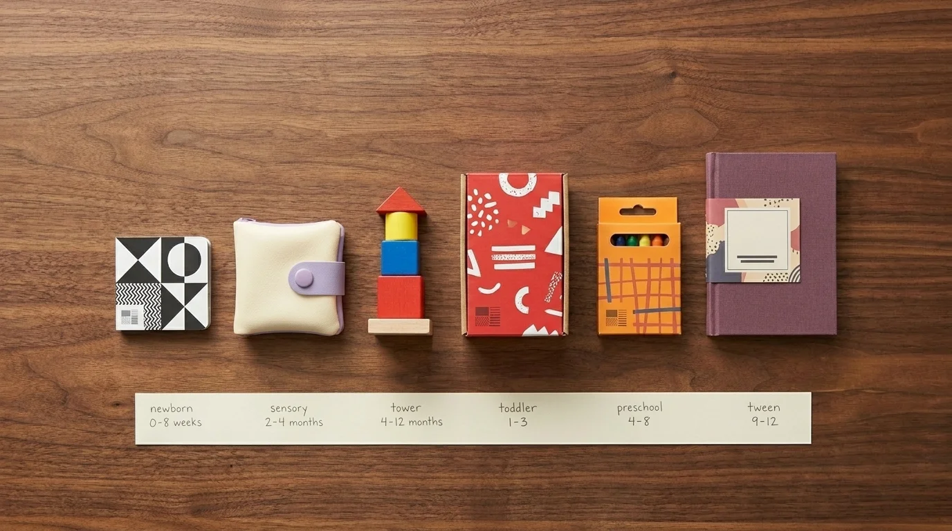
Color × Developmental Stage
The structural moat that no top-ranking color-psychology page currently occupies is mapping the palette decision to the buyer's developmental stage — that is, to the age of the child the product is for. Family-product categories are not interchangeable. A 6-week-old's visual system and a 9-year-old's visual system are doing different things; the packaging palette that lands with the parent-buyer of each is downstream of that.
| Child age window | Vision capability (research-anchored) | What lands at point of purchase | Family-product example category |
|---|---|---|---|
| 0-8 weeks | Primarily black/white/grey processing | High-contrast B&W packaging or "first weeks" muted neutrals | Newborn mobiles, sensory cards |
| 2-4 months | Red discrimination emerging, brighter primaries becoming meaningful | Soft warm primaries; gentle palette | Soft toys, baby books |
| 4-12 months | Adult-comparable color vision; preference for saturated primaries with contrast | Saturated primary palette, simple shapes | Stacking toys, early board books |
| Toddler (1-3) | Strong saturated-primary preference; character recognition begins | Bold primaries + character-led palettes | Fisher-Price toys, Crayola crayons |
| Preschool / early-school (4-8) | Brighter palettes still effective; identity-coded color begins | Saturated brights, distinctive brand palettes | Crayola, Lego, Melissa & Doug |
| Tween (9-12) | Color preference individualises; muted earth tones gain traction | Lower-saturation, more "adult" palettes | Tween apparel, journals, craft kits |
Sources for the developmental side: newborn vision is dominated by white/grey/black for the first 4-8 weeks, with color vision becoming roughly adult-comparable by about 4 months; first preferred hues are red, blue, yellow, and green (Northwest Eye). A 2026 ScienceDirect study on infants' visual engagement confirms longer engagement with colourful, contrasting, simple-shape designs over de-saturated or visually complex ones (ScienceDirect 2026).
The practical implication for a family-product marketer is that "what palette appeals to children" is a moving target across at least four developmental phases, and the brands that ship a single saturated-primary palette across the entire 0-12 range are leaving the considered-purchase parental segments on the table.
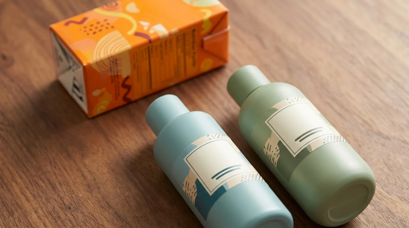
Saturation Strategy by Family-Product Category
A 2026 frame worth knowing about, from SevenKoncepts' marketing analysis: high-saturation hues are now consistently linked to impulse purchase and younger demographics; low-saturation and pastel palettes are linked to considered purchase and older demographics (SevenKoncepts). For family-product marketers, the implication is that the palette decision should track the purchase mode, not just the user.
For impulse-led categories — the toy aisle, the snack pack, the dollar-store craft kit — high saturation is doing exactly the work the research supports. Fisher-Price's #EF4123 red is not subtle on purpose. For considered categories — premium baby skincare, organic infant feeding, nursery decor with a price point above $40 — low-saturation palettes (Aveeno's beiges, the muted greens of Babyganics and Seventh Generation, the Cloud Dancer-adjacent whites that Pantone named Color of the Year 2026) signal exactly the considered, premium, calm associations the considered buyer is pre-disposed to.
This is also where the "Transformative Teal" 2026 forecast lands — a low-saturation blue-green positioned as the evolution of the trust quadrant (Uncomn; ColorWhistle). Family-product brands looking to refresh the cyan-trust position over the next two years can move toward teal without giving up the trust-quadrant placement they have spent decades building.
Protecting Color Equity: The Tropicana Lesson
This is the part of the playbook where the cost of getting it wrong is specific and citable. In 2009 Tropicana redesigned its orange-juice carton, stripping the iconic orange-with-straw imagery and shifting the color palette. Within two months sales had dropped 20%, costing the brand around $30 million in direct revenue and roughly $50 million in total impact when redesign and ad spend are included (The Branding Journal; Avanza Branding). Tropicana reverted in February 2009.
For a family-product marketer the lesson is not "do not redesign". It is that the recognition asset you have built — the wall-of-color a sleep-deprived parent grabs on autopilot from a crowded shelf — is the most expensive single thing the brand owns. Tropicana's juice buyers are not categorically different from diaper buyers; both are doing on-autopilot pattern-matching against a known palette. A diaper brand that strips its Manganese Blue, a baby-food brand that abandons its earthy green, a toy brand that retires its saturated red — each of these is doing a Tropicana, and each will pay a Tropicana-shaped bill.
The defensible rule is to evolve the palette inside the recognized hue family (Manganese Blue toward Transformative Teal, loud green toward authentic muted green), and to bring legacy buyers along visually before announcing the refresh. The cost of getting that wrong is on the order of $30 million in 60 days, in 2009 dollars. Adjust for inflation if you want.
Cross-Cultural Color for Global Family Brands
If your family-product brand ships globally, the palette that works in Toronto or London is not necessarily the palette that works in Shanghai or Riyadh. Two named cases anchor this.
Red Bull, which is not a family-product brand but is a globally distributed CPG with a famous palette, ships silver-and-blue cans in Western markets and gold cans in China — the gold reads as luck, wealth, and status, all of which the silver-blue does not deliver to a Chinese buyer (eTOC). Apple's gold iPhone 5s outperformed expectations in China specifically because the gold hue aligned with the same cultural associations (HI-COM).
The hard one for family-product marketers is that white, which dominates Western baby-product packaging as "clean, premium, gentle", reads as mourning in much of East Asia. A premium baby-product line shipping a white-on-cream package to a Chinese market without local adaptation is making a culturally specific mistake that the Western team did not know they were making. The honest version of "is our packaging globally ready" is that it almost certainly is not, and the regional adaptation is part of the cost of going global.
The 2026 Shifts
Two trends are worth flagging because they are likely to show up in family-product palette refreshes over the next two years.
The first is the "Transformative Teal" forecast already mentioned — a blend of trustworthy dark blue and refreshing green positioned by 2026 brand-strategy reports as the future of branding for offering comfort and authenticity (Uncomn; ColorWhistle). For trust-quadrant family brands, it is a natural evolution of the cyan position.
The second is the authenticity-green shift: environmentally positioned family brands moving from bright, loud greens (which read in 2026 as branded "sustainability theatre") toward natural, unsaturated, muted greens (which read as genuine) (Uncomn). Brands in the organic-baby category — Honest Company, Babyganics, Seventh Generation, Aveeno Baby — are the most exposed to this shift. A loud green wordmark in 2026 is, increasingly, a credibility liability rather than an asset.
A Note on Accessibility, Because Parents Shop One-Handed
A small but real lever that the SERP leaders mostly skip. 2026 reporting from accessibility-aware design analyses links contrast-compliant, color-blind-safe palettes to roughly 12-18% higher engagement across demographics (Jasmine Directory). For family-product brands the practical case is structural: a meaningful fraction of buyers are interacting with the brand on a phone screen, in low light, one-handed, sleep-deprived. A palette that holds contrast in that operating condition wins on margin against one that does not. Accessibility is not a moral add-on here. It is part of the median use case.
What This Means If You Are Running a Family-Product Brand
The honest version of the playbook is small. Sit your brand in one of the structural quadrants (trust-led, visibility-led, premium-led, eco-led) and pick the dominant hue family accordingly. Map your product line to the developmental stage of the child and let saturation track the purchase mode. Protect the recognition asset you have built and evolve the palette inside the hue family rather than across it. Adapt regionally if you ship globally, especially around white. Read the 2026 forecasts as a steer on direction, not as a brief for a six-month rebrand. And design for the parent reading your packaging on a phone at 11pm with a baby on the other shoulder, because that is what the median family-product purchase actually looks like.
The category does not reward novelty. It rewards a palette you have not abandoned.
Frequently Asked Questions
Cool blues, cyans, and teals dominate baby and family-product branding — Pampers (Manganese Blue #00A9A4), Huggies, Gerber, and Aveeno all sit in this trust quadrant. Roughly 33% of top global brands feature blue in their logos, and blue is the single most-preferred colour across both genders. For parents making considered, trust-sensitive purchases, blue — and its 2026 evolution 'Transformative Teal' — signals reliability, calm, and clinical credibility.
Newborns process mostly white, grey, and black for the first 4-8 weeks, then begin recognising red, blue, yellow, and green by 3-4 months. By 4 months infant colour vision is comparable to an adult's. Toddler and preschool products lean into saturated primaries; school-age products use bolder character-led palettes; tweens shift toward muted earth tones. Family-product brands shipping a single primary palette across the entire 0-12 range are leaving considered-purchase segments on the table.
Breaking their existing colour equity during a redesign. Tropicana's 2009 packaging overhaul stripped the iconic orange-with-straw imagery; within two months sales dropped 20%, costing roughly $30 million in direct revenue and ~$50 million in total impact. For family brands whose buyers grab the same diaper, formula, or snack from a crowded shelf on autopilot, abrupt palette changes are the single fastest way to lose recognition and trust.
Two shifts to know about. 'Transformative Teal' (a blend of trustworthy dark blue and refreshing green) is forecast as the future of trust-led branding, a natural evolution of the cyan position dominant in baby-care today. And in eco-positioned categories the trend is from bright 'loud' greens toward natural, unsaturated greens that signal authenticity rather than sustainability theatre — relevant for Honest Company, Babyganics, Seventh Generation, and Aveeno-tier brands.
Four numbers come up repeatedly. Colour drives up to 90% of an initial product impression. 85% of consumers cite colour as a primary purchase-decision factor and 93% of purchase decisions rely on visuals alone. Colour increases brand recognition by up to 80%. And firms maintaining brand consistency (of which colour is the most-cited single component) report up to 20% revenue growth. Sources: USC, HubSpot, SevenKoncepts, Uncomn.
Often yes. Red Bull ships silver-blue cans in Western markets and gold cans in China, where gold reads as luck, wealth, and status. Apple's gold iPhone 5s outperformed expectations in China for the same reason. The harder one for family brands: white, which dominates Western baby-product packaging as 'clean and premium', reads as mourning in much of East Asia. Regional adaptation is part of the cost of going global.